Why Your Gorgeous Website Isn't Getting You Booked (And It's Not Your Fault)
You didn't skip design school. You skipped the part where someone tells you "pretty" and "profitable" aren't the same thing.
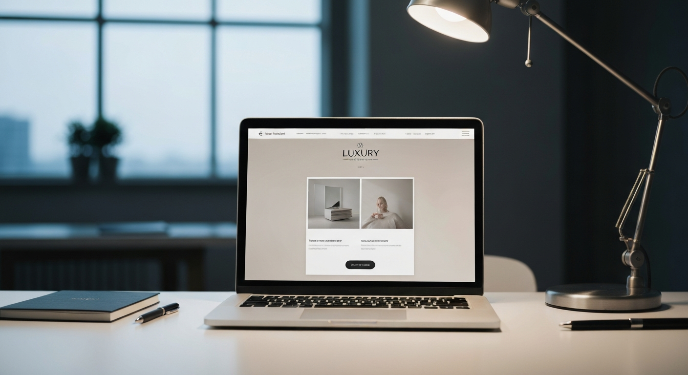
You did everything right. You hired a designer (or spent a weekend obsessing over Squarespace templates). Your color palette is gorgeous. Your portfolio photos are stunning. Your "About" page tells your story beautifully.
And yet... the phone's not ringing. The contact form sits there collecting dust. People land on your site, scroll for a minute, and just... leave.
Here's the thing nobody tells design firms, architects, and service businesses when they're building their website: beautiful and effective are two completely different jobs. One is about how it looks. The other is about what it does. You can absolutely have both—but only if you build for both on purpose.
If your website is gorgeous but quiet, this one's for you.
Your Website Isn't Just a Brochure Anymore

Back in the day, a website was basically a digital business card. You put up your services, your phone number, maybe a few photos, and called it done. People would look, get impressed (hopefully), and call you.
That world is gone.
Today's website needs to function more like a smart website—one that actively works to move visitors toward booking, not just display information and hope for the best. A smart website uses strategic design, automated tools, and intentional pathways to guide someone from "just browsing" to "ready to talk."
Think of it this way: a beautiful website is like a gorgeous storefront with no door handle. People can admire it through the glass, but there's no obvious way to actually walk in. A smart website has the equivalent of a friendly greeter at the door, clear signage to what they need, and an easy checkout process once they decide they want in.
The difference isn't aesthetic. It's mechanical.
The Missing Piece: Conversion Mechanics
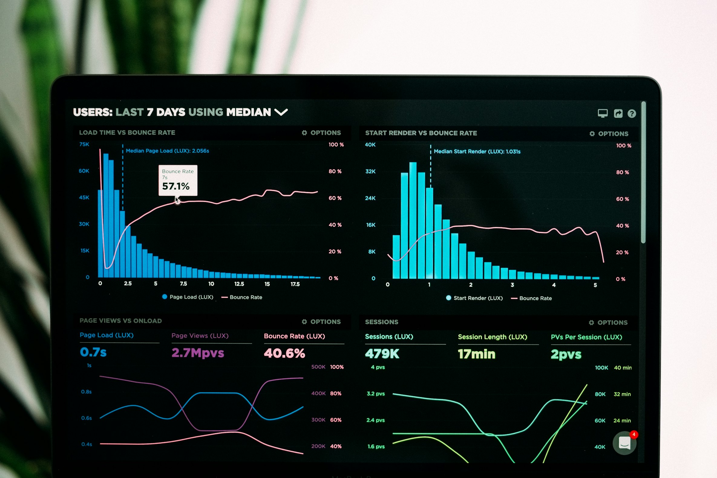
Let's talk about a term that sounds more complicated than it is: conversion mechanics.
All this means is the specific elements on your site that turn a visitor into a lead—someone who actually takes action instead of just looking. Think of conversion mechanics as the gears turning behind the scenes of your website. They're not flashy. Nobody compliments your conversion mechanics at a dinner party. But they're the reason one website generates inquiries and another just generates traffic.
Common conversion mechanics include:
- Clear calls-to-action (CTAs): Not just "Contact Us" buried in a nav menu, but specific, visible prompts like "Schedule Your Free Design Consultation" placed where people are actually looking
- Strategic page flow: Guiding visitors logically from "here's the problem we solve" to "here's proof we're good at it" to "here's how to start"
- Friction reduction: Making it stupidly easy to take the next step—no 12-field forms, no confusing navigation, no "where do I even click" moments
- Trust signals at the right moments: Testimonials, project results, and credentials placed exactly where doubt would naturally creep in
If your gorgeous site is sitting at that bottom number, the design isn't the problem. The plumbing is.
Lead Capture: Catching the Customers Who Aren't Ready to Call Yet
Here's an uncomfortable truth: most people who visit your website are not ready to call you right now. They're researching. Comparing. Saving your site in a tab they'll forget about by Thursday.
If your only conversion option is "call us" or "fill out this contact form," youre losing every single person who isn't at the finish line yet. And in service businesses like design, architecture, and home improvement, most people are nowhere near the finish line on their first visit.
This is where lead capture systems come in. A lead capture system is just a fancy way of saying "a way to collect contact information from people who are interested but not ready to commit yet." Instead of losing that visitor forever, you give them a reason to hand over their email or phone number in exchange for something valuable.
• A downloadable "Design Style Guide" or "Pre-Renovation Checklist" in exchange for an email
• A quiz like "What's Your Design Style?" that ends with a results page and a soft CTA
• A simple "Get Your Free Project Estimate" form that starts the conversation without demanding a phone call
• A newsletter signup offering project inspiration or seasonal tips
The goal isn't to trick anyone. It's to meet people where they actually are in their decision-making process, instead of forcing everyone into a single "call now or leave forever" choice.
Without lead capture, your beautiful website is basically a one-way door. People come in, look around, and if they're not ready to commit immediately, they leave and you never get a second chance. With it, you're building a list of warm prospects you can nurture over time—through email, retargeting ads, or a simple follow-up call.
So Why Doesn't Anyone Tell You This?

Most web designers are, understandably, designers. They're trained to think about visual hierarchy, typography, and brand aesthetics. And that matters—a sloppy, unprofessional-looking site absolutely hurts your credibility.
But design and conversion strategy are two different disciplines that happen to live on the same web page. A designer makes it beautiful. A strategist makes it work. Most businesses only hire for the first one and assume the second one will just... happen.
It won't. Conversion doesn't happen by accident. It happens by design—the strategic kind, not just the visual kind.
This is genuinely not your fault. Nobody handed you a manual that said "by the way, your website also needs a strategic layer underneath the pretty layer." You did exactly what you were told to do: make it look professional. The missing piece was never mentioned because it's a different skill set entirely.
The Good News: This Is Fixable (Without Starting Over)
You don't need to scrap your beautiful website and start from scratch. In most cases, the design is fine—great, even. What's missing is the strategic layer underneath it:
- Auditing where visitors are dropping off
- Adding clear, specific CTAs in the right places
- Building at least one lead capture option for people who aren't ready to call yet
- Simplifying the path from "landed on homepage" to "took an action"
Small, targeted changes. Not a redesign. Just the missing mechanics installed under the hood of what you already built.
Let's Take a Look Under the Hood
If you've got a gorgeous website that's a little too quiet, let's fix that. We'll take a look at what's actually happening when people land on your site, find out where they're dropping off, and figure out exactly what mechanics are missing—no judgment, no jargon, no pressure to rebuild everything from scratch.
Schedule Your Free Website Strategy CallBecause your design deserves a website that works as hard as it looks good. Success by design—the kind that actually books clients.
At Vandergrace Media, we believe gorgeous and effective shouldn't be a trade-off. They should be the same website.